Making the Buttons Easier to See
Ever have someone on your staff squint at the screen and say the buttons kind of blend into the background? Some eyes need a little more separation than others — especially in a dim lounge, under fluorescent lights, or when you've been staring at a register all day. TORO's Display & Accessibility screen lets each person dial the colors in until the buttons pop, without changing anything for anyone else.
Finding It
Open the Dashboard, click the TORO Configuration tab on the left, and click the Display & Accessibility card. (Can't find it? Type "hard to see" or "brightness" in the search box at the top right — it'll come right up.)
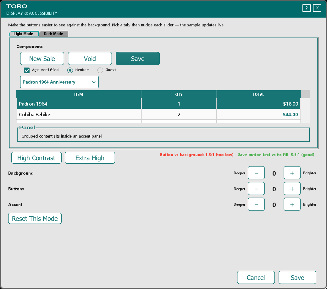
You'll see two tabs — Light Mode and Dark Mode. Each one shows a live sample made of the real TORO parts — buttons, a checkbox, a dropdown, a table, and a panel — and whatever you change, you watch it happen right there on the sample before you save.
The Quick Way: Presets
Most people never need to touch a single slider. At the top are two one-tap buttons:
- High Contrast — pushes the background and buttons apart so the edges of the buttons stand out clearly.
- Extra High — the same idea, turned up further, for eyes that need the most separation.
Tap one, glance at the previews, and if it looks better, hit Save. Done. Each preset sets up both light and dark mode at once.
The Precise Way: The Sliders
If you want to fine-tune it yourself, each mode has three controls. Every one runs from Deeper (darker) on the left to Brighter (lighter) on the right, and you nudge them with the – and + buttons:
- Background — how light or dark the screen behind everything is.
- Buttons — the everyday buttons (like New Sale or Void).
- Accent — the green used on the Save button, the top bar, and the button outlines.
Because Light Mode and Dark Mode have their own set of three, you can set up your daytime look and your nighttime look completely separately. Someone who works both shifts can make each one comfortable.
These only change how light or dark each color is — they never change the actual colors, so TORO still looks like TORO.
The Little Score Under Each Preview
Beneath each sample you'll see two small readouts that spell out what they're comparing, like "Button vs background: 3.4:1 (good)" and "Save-button text vs its fill: 5.1:1 (good)". That number is simply how easy two colors are to tell apart — the higher it is, the clearer the difference — and the word in parentheses sums it up:
- good (green) means you're in good shape.
- close (orange) means it's better than the default but could be clearer.
- too low (red) means those two things are too close together to tell apart easily.
The rule of thumb: 3 or higher means a clear edge. You don't have to chase a perfect number — just nudge things until the buttons look right to your eye and the score backs you up. TORO also won't let you push a slider so far that the writing on a button becomes hard to read; it'll simply stop at that point.
Starting Over
Made a mess of it? Each mode has its own Reset This Mode button that puts that theme back to the standard TORO look. It only resets the mode it's under, so you can start fresh on Light without disturbing your Dark settings.
It's Yours and Yours Alone
This is a per-person setting. When you save, it's tied to your login — so it follows you from register to register, and it doesn't change the screen for the next person who signs in. Everybody on staff can set it up their own way.
Changes take effect the instant you hit Save — no restart, no waiting.
A Note on the Standard Look
Even if nobody ever opens this screen, TORO's everyday buttons already sit clearly in front of the background — that's the starting point everyone gets. The Display & Accessibility screen is there for the people who want to take it further and make it just right for their eyes.